

Here's the card that I created with this color palette:


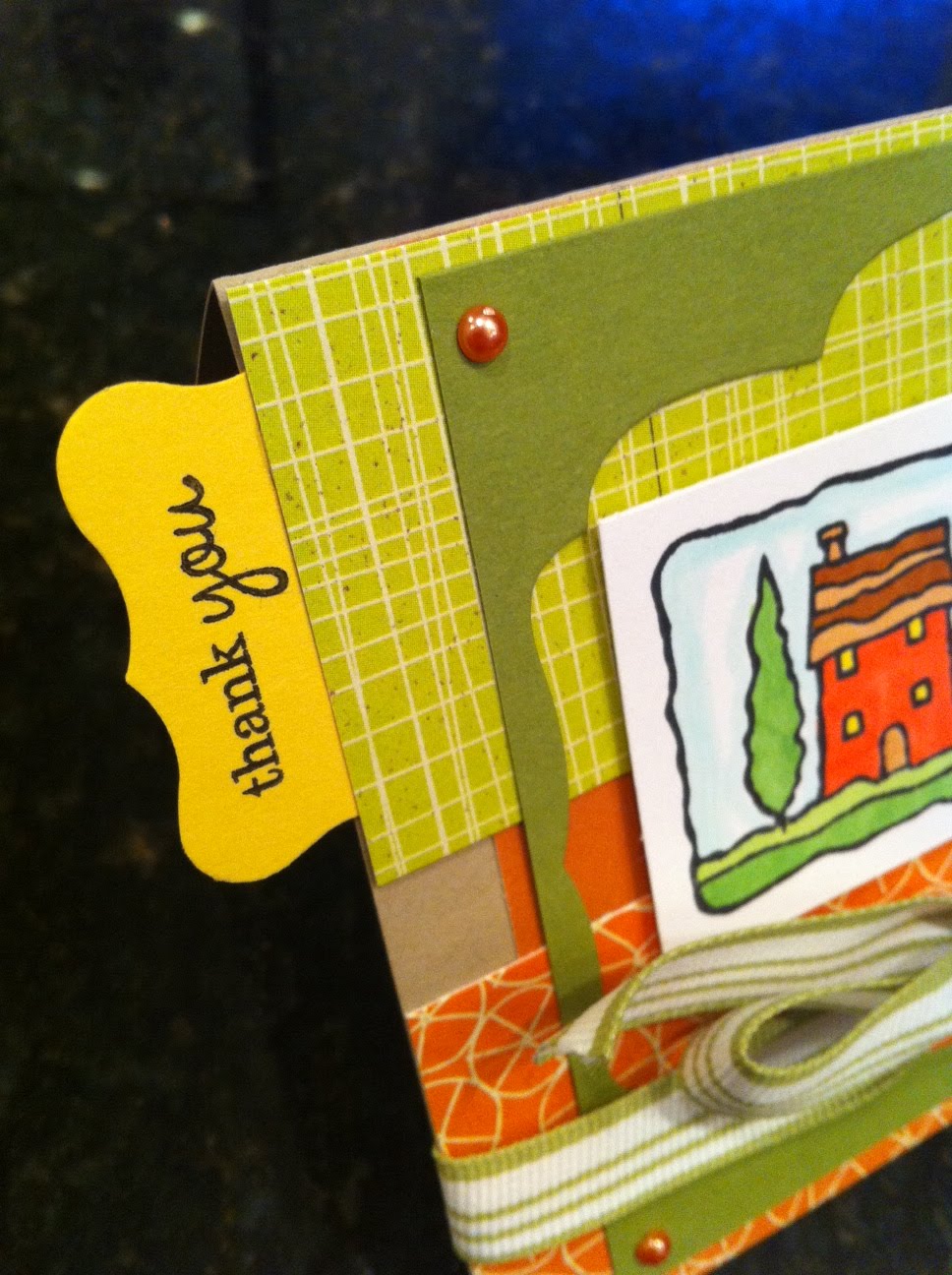

This Scenic Serenity stamp I bought last Black Friday at an amazing sale at one of my local stamp stores...I'm just NOW getting around to using it! (That sale was so great that I actually requested to have Black Friday off from work in February LOL!!) I immediately thought of this stamp with this week's colors because its a Tuscan looking scene and those warm oranges, yellows, and greens go great with that look. I'm pretty pleased with how it all came together. The cut out is actually a scrap from another card, but looks really neat as a window and color accent on this card. The patterned paper is from a K & Company 6x6 pad, the ribbon from SU, the punch for sentiment from SU, the sentiment from the PTI Ribbon Tails stamp set.

You are so right about the Tuscan look of this scene and how well it works with these colors. Beautiful choice of papers, and the frame/opening adds such a fun touch!
ReplyDelete